
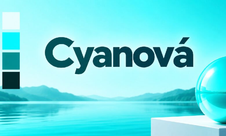
Cyanová is a bright blue-green color term closely connected with cyan. It attracts attention because it sits visually between blue and green and can create a fresh, clear, and modern appearance. Pure digital cyan is commonly represented by the HEX value #00FFFF, although the wider use of Cyanová does not always mean one exact shade.
The color family has an important place in websites, printing, photography, graphic design, branding, fashion, art, and interior decoration. Its appearance can range from extremely bright cyan to softer blue-green tones, depending on how the name is being used.
This guide explains Cyanová meaning, color values, language background, RGB and CMYK systems, history, psychology, design applications, color combinations, and differences from similar colors. It also explains how to use cyan shades correctly across screens, printed materials, and physical products.
What Is Cyanová?
Cyanová generally describes a cyan or vivid blue-green color. It belongs to the visual area between blue and green. When the term is used specifically for pure digital cyan, the commonly associated HEX code is #00FFFF, with RGB values of 0 red, 255 green, and 255 blue. This produces an extremely bright cyan on electronic displays.
However, Cyanová should not always be treated as a separate standardized color with one required value. The established technical color name is cyan, while Cyanová can appear in linguistic, creative, and online contexts connected with the wider cyan family.
This difference matters in professional work. Saying that something should be “Cyanová” gives a general idea of its appearance, but it may not provide enough information for exact reproduction. Designers should provide HEX, RGB, CMYK, or another suitable specification when consistency is important.
Cyanová Meaning and Language Background
The meaning of Cyanová is closely tied to cyan and blue-green color terminology. The word cyan itself has a long linguistic history. Its roots are commonly connected with the Ancient Greek word kyanos, a term historically associated with dark blue substances and colors. Modern cyan, however, developed into a much more specific color concept.
Cyanová should therefore be understood through both language and modern color use. Depending on the context, the word can describe something that is cyan-colored rather than identifying a unique chemical pigment. This is especially important when reading design articles, product descriptions, fashion pages, or color guides.
Color words often change slightly between languages and industries. The same general blue-green appearance may be described as cyan, aqua, turquoise, or another related term. For technical projects, the name provides useful direction, but an exact numerical color value provides much greater accuracy.
Cyanová Color Code and Digital Values
Pure cyan has one of the easiest digital color formulas to understand. Its HEX code is #00FFFF. In the RGB model, this equals 0 red, 255 green, and 255 blue. In HSL notation, pure cyan can be represented as a hue of 180 degrees with 100 percent saturation and 50 percent lightness.
A simplified CMYK reference for cyan is C 100%, M 0%, Y 0%, and K 0%. This does not mean a printed cyan will perfectly match #00FFFF on every screen. RGB describes emitted light, while CMYK describes a process involving physical inks.
These technical values are useful because color names alone can be unclear. If a website developer needs pure cyan, #00FFFF provides a precise digital instruction. If Cyanová is intended to mean a softer, darker, or greener variation, another value should be selected and recorded rather than automatically using pure cyan.
How Cyanová Works in the RGB Color Model
RGB means red, green, and blue. These are the main light components used by electronic screens to produce many different colors. RGB is called an additive system because adding different amounts of colored light creates the final appearance. When all three channels reach maximum intensity, the screen produces white.
Pure cyan is produced differently. Its red channel is set to zero while green and blue are both used at maximum intensity. This creates RGB 0, 255, 255, or #00FFFF. The result can appear especially bright when displayed against black, charcoal, navy, or another dark background.
The same RGB value may still look slightly different from one device to another. Screen technology, brightness, calibration, viewing angle, and color settings can influence appearance. Designers working on important projects should therefore test their Cyanová palette across different displays instead of judging the result on only one screen.
Cyanová and the CMYK Printing System
CMYK stands for cyan, magenta, yellow, and key, with key normally referring to black. It is widely used for commercial printing. Unlike RGB, which produces colors through light, CMYK creates printed results by placing inks on a physical surface. Cyan is therefore one of the central process colors used in modern printing.
A simple description of full process cyan is C 100%, M 0%, Y 0%, and K 0%. In practice, however, printing is more complicated than entering four numbers. Paper type, ink, printer technology, surface coating, lighting, and color profiles can all influence the finished appearance.
A very bright Cyanová shade visible on a monitor may not be reproduced with exactly the same intensity on paper. Professional designers often work with suitable color profiles and printed proofs before approving packaging, posters, brochures, or other important materials. Testing helps prevent unexpected changes between screen and print.
History of Cyan and Blue-Green Colors
Blue and blue-green colors have appeared in human art and decoration for centuries, long before computers or modern printing existed. Artists worked with natural materials and later gained access to manufactured pigments. As color-making technology improved, the available range of blues and blue-greens became wider and more reliable.
Photography added another important chapter through cyanotype. Developed during the nineteenth century, cyanotype is a photographic printing process known for its characteristic blue images. It is a specific chemical process and should not be confused with simply applying a cyan filter to a modern digital photograph.
Commercial printing later gave cyan an even more important technical role. Cyan became one of the standard inks in four-color process printing. Digital screens created another major application because green and blue light can be combined to produce vivid cyan. Cyanová is therefore best understood within this much wider history of blue-green color and technology.
Cyanová in Graphic and Digital Design
Cyanová can be highly useful in graphic design because a bright blue-green shade naturally attracts attention. Designers can apply it to logos, posters, advertisements, illustrations, presentations, icons, infographics, charts, social graphics, and other visual material. It can serve as either an important brand color or a smaller accent within a wider palette.
The amount of cyan used can completely change a design. A small Cyanová highlight against a dark background may create a strong focal point. Large areas of highly saturated #00FFFF can feel much more intense and may become uncomfortable when viewers spend a long time looking at them.
Good design therefore depends on balance rather than brightness alone. Typography, spacing, contrast, background colors, and visual hierarchy should work together. Designers should also keep the same Cyanová specification throughout a project. Changing between several slightly different cyan shades without a clear purpose can make branding and interfaces look inconsistent.
Cyanová in Websites and User Interfaces
Web designers can use Cyanová for buttons, links, icons, active menu items, borders, charts, navigation controls, notifications, and highlighted information. A bright cyan accent can work particularly well in dark interfaces because the difference between the foreground and background can make interactive elements easy to notice.
Visibility, however, does not automatically mean readability. Bright cyan text can be difficult to read against some backgrounds, just as white text may not always provide sufficient contrast on every light cyan shade. Designers should test foreground and background combinations according to appropriate accessibility requirements instead of judging them only by appearance.
Color should also not carry important meaning by itself. For example, a Cyanová indicator representing a particular status should ideally include text, a symbol, shape, or another visual clue. This makes an interface easier to understand for people who experience color differently and creates a clearer experience for all users.
Cyanová in Branding and Packaging
Cyanová can give branding a clean, bright, and contemporary appearance. Different cyan and blue-green shades appear naturally suited to visual identities connected with technology, digital services, water, travel, healthcare, education, creativity, and modern consumer products. However, color alone does not determine how customers will understand a brand.
Companies can carry the chosen shade across logos, websites, advertisements, social media graphics, stationery, presentations, signs, and packaging. An exact color specification becomes important here. If different designers select their own interpretation of Cyanová, the brand can look inconsistent across digital and physical materials.
Packaging requires additional attention because physical materials change color appearance. Matte cardboard, glossy paper, plastic, fabric, and metallic surfaces can produce noticeably different results. A bright shade displayed on a monitor may become softer in print. Testing proofs and real materials helps brands maintain a more predictable visual identity across different applications.
Cyanová in Art and Photography
Artists can use Cyanová and related blue-green shades to represent water, skies, cool shadows, light, abstract forms, underwater scenes, and atmospheric effects. A bright cyan placed beside dark colors can look almost luminous, while a softer cyan surrounded by pale neutrals can create a quieter and more relaxed visual result.
Digital artists often use cyan for glowing objects, futuristic cities, energy effects, holographic displays, gaming artwork, science-fiction scenes, and technology-inspired illustrations. Gradients moving between cyan, blue, purple, and magenta can create strong visual depth when they are controlled carefully.
Photography also has a historical relationship with blue through cyanotype. Modern digital photographers can introduce cyan through editing and color grading, but this is different from making a traditional cyanotype print. Accurate editing also depends on display calibration because a Cyanová tone adjusted on one monitor may appear different on another device or when printed.
Cyanová in Fashion and Interior Design
Cyanová can appear in dresses, shirts, jackets, sportswear, shoes, scarves, bags, jewelry, and other fashion accessories. Bright cyan can create a bold visual statement, while softer blue-green versions can feel more restrained. White, black, gray, navy, beige, and denim can all support cyan without necessarily competing with its strong appearance.
Interior designers can introduce Cyanová through painted walls, furniture, cushions, rugs, curtains, artwork, tiles, or smaller decorative pieces. Natural wood can add warmth to the cool color, while stone, metal, glass, and neutral fabrics can create a more modern atmosphere around it.
Lighting is especially important in physical spaces. A paint sample may look fresh and blue-green in daylight but noticeably different under warm indoor lighting. Fabric texture and surface finish can also influence perception. Testing real samples inside the intended room is more reliable than selecting an interior Cyanová shade entirely from a computer screen.
What Does Cyanová Symbolize?
Cyan and similar blue-green shades are often connected with freshness, clarity, cleanliness, openness, water, technology, creativity, and calmness. These associations help explain why cyan-like colors appear in digital products, modern branding, wellness designs, travel graphics, and visual material connected with water or clean environments.
The exact shade makes a significant difference. Highly saturated #00FFFF can appear energetic, electronic, futuristic, and attention-grabbing. A pale Cyanová tone may feel softer and calmer, while a darker blue-green version can produce a more controlled and serious appearance. Surrounding colors can change these impressions further.
Color psychology should not be treated as a fixed formula. Cyanová does not automatically make every viewer feel calm, creative, or trusting. Culture, personal experience, context, brightness, saturation, and the wider design all influence perception. Designers should therefore use these associations as creative guidance rather than guaranteed emotional effects.
Best Colors to Pair With Cyanová
Cyanová can work with many colors, but the right combination depends on the intended result. White creates a bright and clean palette, while black produces much stronger contrast. Charcoal can make vivid cyan look modern without the extreme difference created by pure black. Navy adds depth while remaining within a cooler color family.
Warmer neutrals can create another useful balance. Beige, cream, light brown, and natural wood tones reduce some of cyan’s visual coolness. In interiors, this combination can prevent a blue-green room from feeling overly cold. Purple and magenta can also work with bright cyan when a more energetic or futuristic appearance is required.
Highly saturated combinations need greater control. Placing several neon-like colors together can make a page, room, package, or outfit visually crowded. Using Cyanová as the main accent while allowing neutral areas to provide visual rest often creates a clearer and more balanced result.
Cyanová vs Cyan, Aqua, Turquoise, Teal, and Aquamarine
Cyanová belongs to the wider blue-green area, but several nearby color names can cause confusion. Cyan is the established technical term and pure digital cyan is commonly represented by #00FFFF. In standard web color terminology, aqua also corresponds to #00FFFF, meaning aqua and cyan can produce exactly the same displayed web color.
Turquoise covers a broader family of blue-green shades and may look greener, softer, or darker than pure digital cyan. Teal is normally much darker and more muted, giving it a deeper appearance that can feel less luminous than bright Cyanová. Aquamarine generally refers to a lighter, softer green-blue appearance.
These names are useful for everyday communication, but they are not always precise enough for professional production. A clothing company, paint maker, designer, and software application may interpret a named shade differently. When exact matching matters, numerical specifications such as HEX, RGB, HSL, CMYK, or another appropriate color standard are more dependable.
Cyanová in Nature and Modern Technology
Blue-green colors occur throughout nature, particularly in water, skies, minerals, marine settings, and some biological structures. Water can appear cyan, blue, or green depending on depth, lighting, particles, reflections, and surrounding conditions. These natural scenes help create the strong visual relationship between cyan-like colors, water, freshness, and open environments.
Technology produces cyan in a more controlled way. Electronic displays can create it by combining green and blue light. Phones, monitors, televisions, digital signs, gaming systems, and other screen technologies can therefore display precise RGB cyan values. Cyan is also useful in digital illustrations, interface graphics, scientific visualization, and simulated lighting.
A naturally observed blue-green shade should not automatically be described as exact #00FFFF. Natural color changes continuously with light and viewing conditions. Pure digital cyan is a mathematical color specification, while Cyanová-like colors in nature are visual appearances created through more complex physical processes.
Benefits and Limitations of Using Cyanová
One major advantage of Cyanová is its flexibility. It can work in websites, branding, packaging, digital artwork, fashion, photography, printed graphics, presentations, and interiors. Bright versions provide strong visibility, while softer versions can create a lighter atmosphere. Cyan also pairs effectively with many neutral, dark, and warm supporting colors.
There are practical limitations. Highly saturated cyan can become visually tiring when it covers very large areas. The same color may also look different across monitors because of calibration, brightness, and display technology. Moving from RGB to printed CMYK can create further changes because screens and physical inks reproduce color differently.
Accessibility must also be considered. A visually attractive Cyanová combination can still provide weak text contrast. Physical paints, inks, fabrics, and dyes may have additional issues such as fading or material-specific safety requirements. These limitations do not make cyan unsuitable; they simply make testing and careful specification important.
How to Use Cyanová Effectively
Start by deciding exactly which Cyanová shade the project needs. If pure digital cyan is required, #00FFFF and RGB 0, 255, 255 provide a clear screen-based reference. If the desired color is softer, darker, greener, or bluer, choose an appropriate value and save it in the project’s design system rather than relying on the name alone.
For printed work, prepare suitable CMYK specifications and use the correct color-management workflow. Important packaging, posters, brochures, or branded materials should be proofed when accurate reproduction matters. Interior projects should be tested with real paint, fabric, tile, or furniture samples under the lighting found in the actual space.
Finally, consider function as well as appearance. Check readability, contrast, consistency, and accessibility. Use intense cyan strategically so important elements can still stand out. A controlled Cyanová palette usually communicates more clearly than a design in which every object competes through equally bright color.
Conculsion
Cyanová is best understood as a color term closely associated with cyan and the wider blue-green family. Pure digital cyan has the well-known HEX value #00FFFF and RGB values of 0, 255, 255. Cyan also plays a fundamental role in CMYK printing, making it important in both digital and physical color reproduction.
Its usefulness reaches far beyond a single code. Cyanová-like colors can appear in graphic design, websites, branding, packaging, photography, art, fashion, interiors, technology, and nature. Different shades can create dramatically different visual effects, from calm and fresh to bright and futuristic.
The most important rule is to use the color with a clear purpose. Exact specifications, suitable contrast, proper color management, physical testing, accessibility, surrounding colors, and lighting all influence the final result. Understanding these factors makes Cyanová much easier to use consistently and effectively.
(FAQs)
What is Cyanová?
Cyanová is a vivid blue-green color closely connected with cyan. It is commonly associated with digital design, printing, branding, photography, fashion, art, and interiors because of its bright and modern appearance.
What is the Cyanová color code?
When Cyanová refers to pure digital cyan, its commonly used HEX code is #00FFFF. Its RGB values are 0, 255, 255, although other Cyanová-style shades may use different values.
Is Cyanová the same as cyan?
Cyanová is closely related to cyan and belongs to the same blue-green color family. Cyan is an established technical color term, while Cyanová may have a broader meaning depending on language and design context.
What colors go well with Cyanová?
Cyanová pairs well with white, black, charcoal, gray, navy, beige, and natural wood shades. Purple and magenta can also work when a brighter, more creative, or futuristic color combination is desired.
Where is Cyanová commonly used?
Cyanová is used in websites, graphic design, digital art, branding, packaging, printing, photography, fashion, advertising, and interior design. Its noticeable blue-green appearance makes it useful for both main colors and visual accents.

